


This case study was a four-person group project for an HCI masters degree course at SUNY Oswego. My team and I decided to enhance the user experience of Brightspace Pulse’s mobile application, a course management system used by several universities. The following process integrates our work as UX designers and researchers.
Students use the Brightspace Pulse mobile app to check grades, view assignments, and access course materials. However, during testing, we found that students had to take extra steps to complete simple tasks.
They struggled to quickly find documents, view all their grades in one place, and access assignment details from the calendar. The app’s navigation required unnecessary clicks and made common actions feel more complicated than they should be.
Our goal was to redesign the app to make everyday student tasks faster, clearer, and easier to complete.

We followed a step-by-step process to understand the problems and improve the experience:
📋User Testing
Each team member tested the original app with one participant. We asked them to complete common tasks like checking grades, finding a syllabus, and viewing upcoming assignments while we observed where they struggled.
📑Organizing Insights
We grouped our findings to identify patterns and common frustrations. This helped us prioritize what needed improvement.
🔁Redesigning Key Features
We created wireframes and interactive prototypes in Figma to improve navigation, add a Grades Overview page, and reorganize the calendar and course pages.
✏️Testing the Redesign
We evaluated the new design to make sure tasks were easier to complete and required fewer steps. Based on that feedback, we made additional improvements.

To find usability issues with the existing Pulse mobile app, my team and I developed an Interview and Testing Script to evaluate how four users use and navigate the application. We individually interviewed, tested, and observed one participant each.
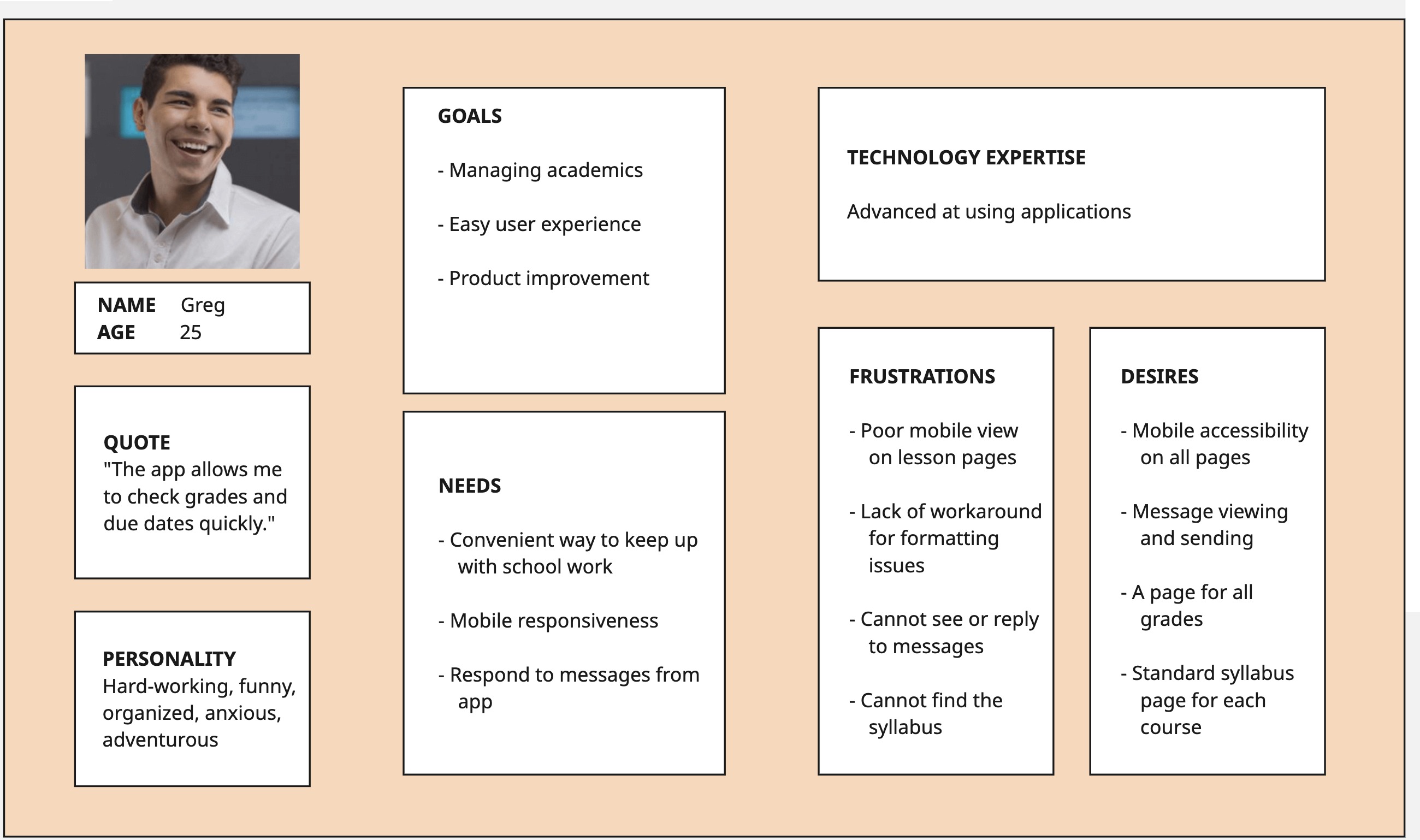
Our focus is students who need a convenient way to quickly check Brightspace for coursework and grades. I created the first persona “Greg” to capture this.
.jpg)
The team and I used Miro to gather and group our results from all four participants in the usability interviews and testing. We each wrote results in the Gather section and then began grouping in the next section to identify common themes.
.jpg)
.jpg)
.jpg)

The team and I worked together to create wireframes and in Figma. Based on our ideation reflections, we created a new menu, Homepage, Course page, Calendar page, and Grades Overview page.


We each conducted cognitive walkthroughs across the four primary tasks: checking notifications, checking grades, finding a syllabus, and locating upcoming assignments.
Overall, all tasks were successfully completed without breakdowns. Navigation labels (e.g., Grades, Notifications, Calendar) aligned clearly with user goals, and system feedback (e.g., unread counters, highlighted selections, shaded folders) reinforced progress toward task completion.
The interface relied heavily on recognition over recall, using familiar icons (hamburger menu, folders, notification badges) and real-world conventions (calendar layout, academic grading terms).
While users could view upcoming assignments on the Calendar page, they could not access assignment details directly from that view.
Link each calendar entry to its corresponding assignment page to reduce friction and improve task continuity.
We evaluated each task flow again with
Nielsen’s 10 Usability Heuristics.

Based on our results and recommendations from the Cognitive Walkthrough and Heuristic Evaluation, we redesigned our interactive prototype in Figma.

Given more time, the team and I would aim to further refine the prototype to enhance usability. We discussed the need for another round of usability testing with new participants.
 The Fourth Floor Website - Startup Website and Data
 UX/UI Research and Design, Data Analysis and Visualization
© 2026 Angela Bernabeo. All rights reserved.
